Bootstrap Grid System
The quickest and easiest approach to design a responsive site layout is with the Bootstrap grid framework.
What is Bootstrap Grid System?
The Bootstrap grid system offers a simple yet powerful method to create responsive layouts of various sizes and shapes. Built with flexbox and following a mobile-first approach, it provides a fully responsive structure with a twelve-column system per row and six default responsive tiers.
By utilizing Bootstrap's predefined grid classes, you can easily design layouts tailored for different devices such as mobile phones, tablets, laptops, and desktops. For instance, the .col-* classes are used for extra small devices like mobile phones in portrait mode, while .col-sm-* classes are ideal for mobile phones in landscape mode.
Similarly, you can employ .col-md-* classes for medium-sized screens like tablets, .col-lg-* classes for small laptops, .col-xl-* classes for laptops and desktops, and .col-xxl-* classes for large desktop screens.
| Features Bootstrap Grid System | X-Small (xs) <576px |
Small (sm) ≥576px |
Medium (md) ≥768px |
Large (lg) ≥992px |
X-Large (xl) ≥1200px |
XX-Large (xxl) ≥1400px |
|---|---|---|---|---|---|---|
| Container max-width | None (auto) | 540px | 720px | 960px | 1140px | 1320px |
| Class prefix | .col- |
.col-sm- |
.col-md- |
.col-lg- |
.col-xl- |
.col-xxl- |
| Number of columns | 12 | |||||
| Gutter width | 1.5rem (.75rem on left and right) | |||||
| Custom gutters | Yes | |||||
| Nestable | Yes | |||||
| Column ordering | Yes | |||||
To clarify, applying any .col-sm-* class to an element will affect not only small devices but also medium, large, and extra-large devices (viewport width ≥768px) if a .col-md-, .col-lg-, .col-xl-, or .col-xxl- class is not specified.
Similarly, the .col-md-* class will not only impact medium devices but also large and extra-large devices if a .col-lg-, .col-xl-, or .col-xxl-* class is not used.
To implement rows and columns using this responsive grid system, you simply create a container as a wrapper for your rows and columns using container classes like .container . Inside the container, create rows with the .row class, and within these rows, you can define columns using the .col-, .col-sm-, .col-md-, .col-lg-, .col-xl-* and .col-xxl-* classes.
Columns represent the actual content areas where you place your contents.
Creating Two Column Layouts
To create a two-column layout for medium, large, and extra-large devices like tablets, laptops, and desktops, you can use the following example code. On mobile phones (screen width less than 768px), the columns will automatically stack vertically into two rows with one column each.
<!--Row with two equal columns-->
<div class="row">
    <div class="col-md-7">
        <div class="demo-content">.col-md-7</div>
    </div>
    <div class="col-md-9">
        <div class="demo-content bg-alt">.col-md-9</div>
    </div>
</div>

<!--Row with two columns divided in 1:2 ratio-->
<div class="row">
    <div class="col-md-6">
        <div class="demo-content">.col-md-6</div>
    </div>
    <div class="col-md-3">
        <div class="demo-content bg-alt">.col-md-3</div>
    </div>
</div>
Note: In a grid layout, it's essential to place content inside columns (.col and .col-*), and only columns can be immediate children of rows (.row). Additionally, rows should be situated inside a container (either fixed or fluid) to ensure proper padding and alignment.
Tip: The grid column widths are defined in percentages, ensuring they remain fluid and relative to their parent element. Each column also has horizontal padding (gutter) to control the space between individual columns.
As the Bootstrap grid system is based on 12 columns, to keep columns in a single line (side by side), the sum of the grid column numbers within a row should not exceed 12. In the above example code, you'll observe that the grid column numbers ( col-md-*) add up to twelve (6+6, 4+8, and 3+9) for each row.
Creating Three Column Layouts
Similarly, you can create other layouts following the same principle. For instance, the following example will typically create three-column layouts for laptops and desktop screens. It will also adapt to tablets in landscape mode (screen resolution more than or equal to 992 pixels, e.g., Apple iPad), while retaining the usual horizontal stacking in portrait mode.
<div class="container">
        <!--Row with three equal columns-->
        <div class="row">
            <div class="col-lg-5">
                <div class="demo-content">.col-lg-5</div>
            </div>
            <div class="col-lg-5">
                <div class="demo-content bg-alt">.col-lg-5</div>
            </div>
            <div class="col-lg-5">
                <div class="demo-content">.col-lg-5</div>
            </div>
        </div>
Note: If a row contains more than 12 grid columns, any additional columns will wrap to a new line as a group. This behavior is known as column wrapping.
Bootstrap Auto-layout Columns
To create equal-width columns for all devices, including x-small, small, medium, large, x-large, and xx-large, you can use the .col class without specifying the column number.
Let's try out the following example to understand how it exactly works:
<div class="container">
<!--Row with two equal columns-->
<div class="row">
    <div class="col">.col</div>
    <div class="col">.col</div>
</div>
</div>
Moreover, you have the option to set the width of one column and let the sibling columns automatically resize around it equally. This can be achieved using the predefined grid classes or inline widths.
In the following example, you'll find columns in a row with the class .col having equal width.
<div class="container">
<!--Row with two equal columns-->
<div class="row">
    <div class="col">.col</div>
    <div class="col">.col</div>
</div>

<!--Row with three columns divided in 1:2:1 ratio-->
<div class="row">
    <div class="col">.col</div>
    <div class="col-sm-5">.col-sm-5</div>
    <div class="col">.col</div>
</div>
</div>
Column Wrapping Behavior
Moving forward, we will create more flexible layouts that adjust the column orientation based on the viewport size. The next example will create a three-column layout on large devices like laptops and desktops, as well as on tablets (e.g., Apple iPad) in landscape mode. However, on medium devices like tablets in portrait mode (768px ≤ screen width < 992px), it will change into a two-column layout where the third column moves to the bottom of the first two columns.
<div class="container">
<div class="row">
<div class="demo-content">.col-md-4 .col-lg-3</div>
<div class="demo-content bg-alt">.col-md-8 .col-lg-6</div>
<div class="demo-content">.col-md-12 .col-lg-3</div>
</div>
</div>
As seen in the example above, the sum of the medium grid column numbers (i.e., col-md-*) is 3 + 9 + 12 =24>12, which exceeds the maximum number of columns in a .row. As a result, the third <div> element with the class .col-md-12, which is adding the extra columns beyond the maximum 12 columns in a .row, gets wrapped onto a new line as one contiguous unit on medium-sized devices.
Similarly, you can create even more adaptable layouts for your websites using Bootstrap's grid column wrapping feature. Below are some ready-to-use Bootstrap grid examples.
Creating Multi-Column Layouts with Bootstrap
With the new Bootstrap mobile-first flexbox grid system, you can easily control how your website layout will render on different types of devices with varying screen or viewport sizes, such as mobile phones, tablets, and desktops. The illustration below shows how the layout changes based on different device screen sizes:
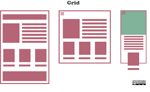
In the above illustration, there are a total of 12 content boxes on all devices, but their placement varies according to the device screen size. For example, on a mobile device, the layout is rendered as a one-column grid layout with 1 column and 12 rows placed above one another. On a tablet, it is rendered as a two-column grid layout with 2 columns and 6 rows.
Moreover, for large screen devices like laptops and desktops, the layout is rendered as a three-column grid layout with 3 columns and 4 rows. On extra-large screen devices, such as large desktops, it is rendered as a four-column grid layout with 4 columns and 3 rows.
To create such responsive layouts using the Bootstrap flexbox grid system, you can start with the primary target device, which, in this case, is the laptop or normal desktop. Since the laptop layout has a 3x4 grid layout, the HTML code for such a grid structure would look something like this:
<div class="container-lg">
        <div class="row">
            <div class="col-xl-4"><p>Text 1</p></div>
            <div class="col-xl-4"><p>Text 2</p></div>
            <div class="col-xl-4"><p>Text 3</p></div>
        </div>
    </div>
Tip: The .container-lg class ensures that the container is 100% wide when the viewport width is less than 992px, utilizing the full available width on smaller screens.
Customizing the layout for other devices involves adding specific classes to make it responsive. For example, to customize the layout for medium devices like tablets (768px ≤ viewport width < 1200px), you can add the class .col-md-6 to each column to render the layout as a 2x6 grid.
<div class="container-lg">
        <div class="row">
            <div class="col-xl-4 col-md-6"><p>Model 1</p></div>
            <div class="col-xl-4 col-md-6"><p>Model 2</p></div>
            <div class="col-xl-4 col-md-6"><p>Model 3</p></div>
        </div>
    </div>
Tip: It's essential to choose your primary target device and create the layout for that device first. After that, you can add classes to make it responsive for other devices.
Similarly, for extra-extra-large devices, like large desktop screens, you can add the class .col-xxl-3 to each column to create a 4x3 grid layout.
<div class="container-lg">
        <div class="row">
            <div class="col-xl-4 col-md-6 col-xxl-3"><p>Model 1</p></div>
            <div class="col-xl-4 col-md-6 col-xxl-3"><p>Model 2</p></div>
            <div class="col-xl-4 col-md-6 col-xxl-3"><p>Model 3</p></div>
        </div>
    </div>
Tip: Based on the provided illustration, there is no requirement to customize the layout specifically for mobile phones. This is because on extra small devices, the columns will automatically stack horizontally and create a 1x12 column grid layout if no .col-* or .col-sm-* classes are applied. In other words, the default behavior for extra small devices ensures that the columns are displayed in a single row, occupying the full width of the screen.
Nesting of Grid Columns
The Bootstrap grid columns are also nestable, meaning you can put rows and columns inside an existing column. However, the sum of column numbers within a single row should be equal to 12 or less.
<div class="container mt-3">
    <div class="row">
        <div class="col-sm-8">
            <div class="main-content"></div>
        </div>
        <div class="col-sm-4">
            <!--Nested rows within a column-->
            <div class="row">
                <div class="col-12">
                    <div class="sidebar-content"></div>
                </div>
            </div>
Creating Variable Width Columns
You can use the col-{breakpoint}-auto classes to size columns based on the natural width of their content, as shown in the example.
<div class="container">
        <div class="row justify-content-md-center">
            <div class="col-md-3">left side</div>
            <div class="col-md-auto">variables</div>
            <div class="col-md-3"> right side</div>
        </div>
        <div class="row">
            <div class="col">left side</div>
            <div class="col-auto">Variables</div>
            <div class="col">right side</div>
        </div>
    </div>
Alignment of Grid Columns
Flexbox alignment utilities allow you to vertically and horizontally align grid columns inside a container.
Vertical Alignment of Grid Columns
The classes .align-items-start, .align-items-center, and .align-items-end can be used to align the grid columns vertically at the top, middle, and bottom of a container, respectively.
<div class="container">
    <div class="row align-items-start">
        <div class="col">step one </div>
        <div class="col">step two</div>
        <div class="col">step three</div>
    </div>
    <div class="row align-items-center">
        <div class="col">step one</div>
        <div class="col">step two</div>
        <div class="col">step three</div>
    </div>
    <div class="row align-items-end">
        <div class="col">step one</div>
        <div class="col">step two</div>
        <div class="col">step three</div>
    </div>
</div>
Additionally, individual columns inside a row can be aligned vertically using the appropriate classes.
<div class="container">
    <div class="row">
        <div class="col align-self-start">step one</div>
        <div class="col align-self-center">step two</div>
        <div class="col align-self-end">step three</div>
    </div>
</div>
Note: Using just the .col class without specifying a number in the .col-* grid class will create equal-size columns for all devices (extra small, small, medium, large, and extra large).
Horizontal Alignment of Grid Columns
The classes .justify-content-start, .justify-content-center, and .justify-content-end can be used to align the grid columns horizontally at the left, center, and right of a container, respectively. The example demonstrates how this works.
<div class="container">
    <div class="row justify-content-start">
        <div class="col-4">step one</div>
        <div class="col-4">step two</div>
    </div>
    <div class="row justify-content-center">
        <div class="col-4">step one</div>
        <div class="col-4">step two</div>
    </div>
    <div class="row justify-content-end">
        <div class="col-4">step one</div>
        <div class="col-4">step two</div>
    </div>
</div>
Alternatively, for more precise column distribution, you can utilize the class .justify-content-around, which evenly distributes grid columns with half-sized spaces on both ends. On the other hand, the class .justify-content-between ensures an even distribution of grid columns, with the first column placed at the start and the last column placed at the end. You can try out the following example to observe how these classes function:
<div class="container">
    <div class="row justify-content-around">
        <div class="col-4">step one</div>
        <div class="col-4">step two</div>
    </div>
    <div class="row justify-content-between">
        <div class="col-4">step one</div>
        <div class="col-4">step two</div>
    </div>
</div>
If you wish to learn more about flex items alignment, please refer to the tutorial on CSS3 flexbox.
Reordering of Grid Columns
Moreover, you have the flexibility to change the visual order of your grid columns without altering their order in the actual markup. Utilize the class .order-last to place the column at the end, or the class .order-first to place it at the beginning. Here's an example to demonstrate:
<div class="container">
        <div class="row">
            <div class="col order-last"> ordered at last</div>
            <div class="col"> unordered</div>
            <div class="col order-first"> ordered at first</div>
        </div>
    </div>
To further order grid columns based on specific order numbers, you can employ the .order-* classes. Columns with higher order numbers appear after those with lower order numbers or columns with no order classes. These classes cover order numbers from 1 to 12 across all five grid tiers.
 <div class="container">
        <div class="row">
            <div class="col order-4"> ordered at last</div>
            <div class="col"> ordered at first</div>
            <div class="col order-1"> ordered at second</div>
        </div>
    </div>
Offsetting the Grid Columns
You have the option to align grid columns to the right using column offset classes like .offset-sm-*, .offset-md-*, .offset-lg-*, and so on. These classes offset the columns by increasing their left margin by a specified number of columns.
For instance, adding the class .offset-md-4 to a column with the class .col-md-8 will move it to the right by four columns from its original position. You can try out the following example to see how this offsetting works:
<div class="container mt-3">
    <div class="row">
        <div class="col-md-4">
            <div class="demo-content">.col-md-4</div>
        </div>
        <div class="col-md-8">
            <div class="demo-content bg-alt">.col-md-8</div>
        </div>
    </div>
In situations where the offset width is not fixed, you can also achieve column offsetting using margin utility classes. Here's an example to illustrate this:
<div class="container mt-3">
    <div class="row">
        <div class="col-md-4">
            <div class="demo-content">.col-md-4</div>
        </div>
Note: For columns that only need to take up as much space as needed based on their contents, you can utilize the class .col-auto. This allows the column to size itself accordingly.
Creating Compact Columns
If you wish to create compact layouts without gutters between columns, you can add the class .g-0 on .row. This class removes the negative margins from the row and horizontal padding from all immediate children columns. Here's an example:
<div class="container mt-3">
        <div class="row">
            <div class="col-4">
                <div class="demo-content">.col-4</div>
            </div>
Breaking Columns to a New Line
Moreover, you can create equal-width columns that multiple rows by inserting a <div> with the class .w-100 where you want the columns to break to a new line. Additionally, you can make these breaks responsive by combining the .w-100 class with responsive display utility classes.
<div class="container">
        <h4 class="mt-3">breaking columns across all platforms </h4>
        <div class="row">
            <div class="col">.col</div>
            <div class="col">.col</div>
            <div class="w-100"></div>
            <div class="col">.col</div>
            <div class="col">.col</div>
        </div>
We hope this explanation has provided you with a good understanding of the basics of the new Bootstrap 5 grid system. In the upcoming chapters, you will learn how to create basic web page layouts using this flexbox grid system.
FAQ
What is the Bootstrap grid system?
The Bootstrap grid system is a responsive, mobile-first layout system that allows you to create flexible and structured page layouts by dividing the content into rows and columns. It consists of 12 columns in a row and is designed to work well on various screen sizes and devices.
How do you create a basic Bootstrap grid layout?
To create a basic Bootstrap grid layout, you need to use the .container, .row, and .col-* classes. Here's an example of a simple layout:
<div class="container">
  <div class="row">
    <div class="col-sm-6">Column 1</div>
    <div class="col-sm-6">Column 2</div>
  </div>
</div>
What is the purpose of the .container class in Bootstrap's grid system?
The .container class is used to create a fixed-width container that centers your content and maintains consistent margins on the left and right sides. It ensures that the content doesn't stretch to the full width of the viewport.
How can you create a full-width container in Bootstrap?
To create a full-width container in Bootstrap, you can use the .container-fluid class. This class spans the entire viewport width, allowing your content to expand to the edges of the screen.
What are responsive classes in Bootstrap, and how do they work?
Responsive classes like .col-sm-*, .col-md-*, and .col-lg-* allow you to control the number of columns a specific element occupies on different screen sizes. For example, .col-sm-6 means the element occupies 6 columns on small screens.
How do you create a two-column layout for large screens and a one-column layout for small screens in Bootstrap?
You can achieve this using responsive classes. For a two-column layout on large screens and a one-column layout on small screens, you can use the following code:
<div class="container">
  <div class="row">
    <div class="col-lg-6 col-sm-12">Column 1</div>
    <div class="col-lg-6 col-sm-12">Column 2</div>
  </div>
</div>
How can you create an offset for a column in Bootstrap?
You can create an offset for a column by using offset classes like .offset-*. For example, to offset a column by 2 columns, use .offset-2.
<div class="container">
  <div class="row">
    <div class="col-md-4">Column 1</div>
    <div class="col-md-4 offset-md-2">Column 2 with offset</div>
  </div>
</div>
What is the purpose of the .order-* classes in Bootstrap's grid system?
The .order-* classes allow you to control the order of columns within a row. You can use these classes to change the order of columns on different screen sizes.
<div class="container">
  <div class="row">
    <div class="col-md-4 order-2">Column 1</div>
    <div class="col-md-4 order-1">Column 2</div>
  </div>
</div>
How do you create a nested grid structure in Bootstrap?
To create a nested grid structure, you can place a new .row and columns inside an existing .col-*. This allows for more complex layouts. Here's an example:
<div class="container">
  <div class="row">
    <div class="col-md-6">Column 1</div>
    <div class="col-md-6">
      <div class="row">
        <div class="col-md-6">Nested Column 1</div>
        <div class="col-md-6">Nested Column 2</div>
      </div>
    </div>
  </div>
</div>
What is the .align-items-* class used for in Bootstrap's grid system?
The .align-items-* class is used to vertically align all columns within a row. You can apply classes like .align-items-start, .align-items-center, or .align-items-end to the row to control the vertical alignment of all columns within that row.
<div class="container">
  <div class="row align-items-center">
    <div class="col-md-4">Column 1</div>
    <div class="col-md-4">Column 2</div>
  </div>
</div>
How do you center content horizontally within a Bootstrap column?
To center content horizontally within a Bootstrap column, you can use the .text-center class. Here's an example:
<div class="container">
  <div class="row">
    <div class="col-md-6 text-center">Centered Content</div>
  </div>
</div>
What is the purpose of the .g-* classes in Bootstrap 5, and how do they affect the grid layout?
The .g-* classes in Bootstrap 5 are used to control the spacing between columns and rows. For example, .g-2 adds a 2rem gap between columns and rows. These classes help customize the gutters and spacing in the grid layout.
<div class="container">
  <div class="row g-3">
    <div class="col-md-4">Column 1</div>
    <div class="col-md-4">Column 2</div>
  </div>
</div>
How do you create an equal-width column layout using Bootstrap?
To create an equal-width column layout, you can use the .col class. This class makes all columns within a row occupy an equal portion of the available space.
<div class="container">
  <div class="row">
    <div class="col">Column 1</div>
    <div class="col">Column 2</div>
    <div class="col">Column 3</div>
  </div>
</div>
How can you hide or show elements based on screen size in Bootstrap?
You can use the .d-*-none and .d-*-block classes to hide or show elements based on screen size. For example, .d-sm-none hides an element on small screens, and .d-md-block shows it on medium screens.
<div class="container">
  <div class="row">
    <div class="col-md-6 d-md-none">Hidden on medium screens</div>
    <div class="col-md-6 d-md-block">Visible on medium screens</div>
  </div>
</div>
How can you apply custom CSS alongside Bootstrap's grid system to style your layout further?
You can apply custom CSS alongside Bootstrap's grid system by adding your CSS rules in a separate stylesheet or using inline styles. Ensure that your custom styles don't conflict with Bootstrap's classes.
<style>
  .custom-style {
    background-color: lightblue;
  }
</style>
<div class="container">
  <div class="row">
    <div class="col-md-6 custom-style">Custom Styled Column</div>
    <div class="col-md-6">Regular Column</div>
  </div>
</div>
How do you make columns stack on top of each other for small screens in Bootstrap?
Columns will automatically stack on top of each other for small screens in Bootstrap. You don't need to apply specific classes to achieve this behavior; it's the default behavior for columns on small screens.
<div class="container">
  <div class="row">
    <div class="col-md-4">Column 1</div>
    <div class="col-md-4">Column 2</div>
  </div>
</div>
What is the difference between the .container-xl and .container classes in Bootstrap 5?
The .container-xl class in Bootstrap 5 creates an extra-large fixed-width container. It's similar to the standard .container class but provides a wider maximum content width, suitable for larger screens.
<div class="container-xl">
  <!-- Content goes here -->
</div>
How can you create a responsive layout where columns change their order on different screen sizes in Bootstrap?
You can use the .order-* classes in Bootstrap to change the order of columns on different screen sizes. Here's an example:
<div class="container">
  <div class="row">
    <div class="col-md-4 order-2">Column 1</div>
    <div class="col-md-4 order-1">Column 2</div>
  </div>
</div>
How can you make an image responsive within a Bootstrap column?
To make an image responsive within a Bootstrap column, add the .img-fluid class to the img element. This class ensures that the image scales properly to fit the width of the column.
<div class="container">
  <div class="row">
    <div class="col-md-6">
      <img src="image.jpg" class="img-fluid" alt="Responsive Image">
    </div>
  </div>
</div>
How do you control the vertical alignment of a single column within a Bootstrap row?
To control the vertical alignment of a single column within a Bootstrap row, you can use the .align-self-* class. For example, .align-self-center vertically centers the specific column.
<div class="container">
  <div class="row">
    <div class="col-md-6 align-self-center">Vertically Centered Column</div>
  </div>
</div>
How can you create a fixed-width layout in Bootstrap with a container that doesn't change its size based on the screen width?
To create a fixed-width layout in Bootstrap, you can use the .container class. It ensures that the container maintains a fixed width and doesn't change its size based on the screen width.
<div class="container">
  <!-- Content goes here -->
</div>
How do you control the horizontal alignment of columns within a Bootstrap row?
You can control the horizontal alignment of columns within a Bootstrap row by using the .justify-content-* classes. For example, .justify-content-end aligns columns to the right, while .justify-content-center centers them horizontally.
<div class="container">
  <div class="row justify-content-end">
    <div class="col-md-4">Right-aligned Column</div>
    <div class="col-md-4">Right-aligned Column</div>
  </div>
</div>
How can you create a two-column and three-column layout in Bootstrap?
You can create a two-column layout in Bootstrap by using the .col-* class. To create a three-column layout, you can divide the available
width into equal thirds by using .col-md-4 for each column. Here's an example:
<div class="container">
  <div class="row">
    <div class="col-md-6">Column 1</div>
    <div class="col-md-6">Column 2</div>
  </div>
</div>

<div class="container">
  <div class="row">
    <div class="col-md-4">Column 1</div>
    <div class="col-md-4">Column 2</div>
    <div class="col-md-4">Column 3</div>
  </div>
</div>
How can you align columns vertically in Bootstrap?
You can align columns vertically using .align-items-* classes on the row. For example, .align-items-center vertically centers the columns:
<div class="container">
  <div class="row align-items-center">
    <div class="col-md-6">Vertically Centered Column</div>
    <div class="col-md-6">Vertically Centered Column</div>
  </div>
</div>
How can you align columns horizontally in Bootstrap?
You can align columns horizontally using .justify-content-* classes on the row. For example, .justify-content-end aligns columns to the right:
<div class="container">
  <div class="row justify-content-end">
    <div class="col-md-4">Right-aligned Column</div>
    <div class="col-md-4">Right-aligned Column</div>
  </div>
</div>
What is the purpose of the .row-cols-* class in Bootstrap 5?
The .row-cols-* class is used in Bootstrap 5 to set the number of columns for a grid row. For example, .row-cols-2 ensures that the row contains two columns by default.
<div class="container">
  <div class="row row-cols-2">
    <div class="col">Column 1</div>
    <div class="col">Column 2</div>
  </div>
</div>
How do you create a multi-column layout with auto-layout in Bootstrap?
To create a multi-column layout with auto-layout in Bootstrap, you can use the .col class for each column. This allows columns to take up equal space within the row.
<div class="container">
  <div class="row">
    <div class="col">Auto Column 1</div>
    <div class="col">Auto Column 2</div>
    <div class="col">Auto Column 3</div>
  </div>
</div>
How can you create compact columns in Bootstrap?
You can create compact columns by using the .gap-* classes in Bootstrap 5. For example, .gap-2 reduces the space between columns.
<div class="container">
  <div class="row gap-2">
    <div class="col-md-4">Column 1</div>
    <div class="col-md-4">Column 2</div>
  </div>
</div>
How do you make columns wrap to a new line when the screen width is insufficient in Bootstrap?
Columns automatically wrap to a new line in Bootstrap when the screen width is insufficient. You don't need to add specific classes for this behavior; it's the default.
<div class="container">
  <div class="row">
    <div class="col-md-4">Column 1</div>
    <div class="col-md-4">Column 2</div>
    <div class="col-md-4">Column 3</div>
  </div>
</div>
How can you create a multi-column layout with different column widths in Bootstrap?
You can create a multi-column layout with different column widths by using responsive classes like .col-md-*, .col-lg-*, and .col-xl-* to specify the width for each column.
<div class="container">
  <div class="row">
    <div class="col-md-6 col-lg-4">Column 1</div>
    <div class="col-md-6 col-lg-4">Column 2</div>
    <div class="col-lg-4 d-none d-lg-block">Column 3 (visible on large screens)</div>
  </div>
</div>
How do you create a multi-column layout where the number of columns changes based on screen size in Bootstrap?
To create a multi-column layout with a varying number of columns, you can use responsive classes such as .col-*, .col-sm-*, .col-md-*, and so on, to control the number of columns on different screen sizes.
<div class="container">
  <div class="row">
    <div class="col-12 col-sm-6 col-md-4 col-lg-3">Column 1</div>
    <div class="col-12 col-sm-6 col-md-4 col-lg-3">Column 2</div>
    <div class="col-12 col-sm-6 col-md-4 col-lg-3">Column 3</div>
    <div class="col-12 col-sm-6 col-md-4 col-lg-3">Column 4</div>
  </div>
</div>
How can you align multi-column layouts horizontally within a Bootstrap row?
You can align multi-column layouts horizontally within a Bootstrap row by using .justify-content-* classes. For example, .justify-content-between evenly distributes the columns horizontally.
<div class="container">
  <div class="row justify-content-between">
    <div class="col-md-4">Column 1</div>
    <div class="col-md-4">Column 2</div>
    <div class="col-md-4">Column 3</div>
  </div>
</div>
How can you align multi-column layouts vertically within a Bootstrap row?
You can align multi-column layouts vertically within a Bootstrap row by using .align-items-* classes. For example, .align-items-end aligns the columns to the bottom.
<div class="container">
  <div class="row align-items-end">
    <div class="col-md-4">Column 1</div>
    <div class="col-md-4">Column 2</div>
    <div class="col-md-4">Column 3</div>
  </div>
</div>
What is the purpose of the .no-gutters class in Bootstrap's grid system?
The .no-gutters class is used to remove gutters (spacing) between columns and rows in a grid layout. It's useful when you want elements to be closer or touch each other directly.
<div class="container">
  <div class="row no-gutters">
    <div class="col-md-4">Column 1</div>
    <div class="col-md-4">Column 2</div>
  </div>
</div>
Conclusion
The Bootstrap framework provides a powerful and flexible toolkit for designing responsive web layouts, with a strong focus on the grid system. The Bootstrap grid columns layout offers the foundation for creating adaptable and visually pleasing designs. By utilizing responsive grid principles and grid classes, you can easily craft layouts that seamlessly adjust to various screen sizes and devices.
The fluid grid and grid breakpoints in Bootstrap ensure that your designs remain effective and consistent across a wide range of viewports. The ability to control grid alignment further enhances the aesthetic and usability of your web pages.
When aiming for more complex and multi-column designs, Bootstrap offers a plethora of options for multi-column layouts. Whether you're implementing a two-column layout, creating three-column layouts, or exploring multi-column responsive design, Bootstrap's grid for multiple columns and building multi-column layouts ensure your design needs are met. Column classes provide you with the necessary tools to fine-tune your layout.
Moreover, Bootstrap's capabilities extend beyond horizontal alignment; you can also manage vertical column alignment with ease. By focusing on aligning columns vertically, vertical alignment of columns, and vertical positioning of columns, you can achieve a balanced and visually appealing design. Bootstrap's vertical alignment classes simplify this process.
Additionally, for those seeking horizontal column alignment, Bootstrap offers a range of techniques for aligning columns horizontally, centering columns horizontally, and managing horizontal alignment of columns. The horizontal positioning of columns and Bootstrap horizontal alignment classes provide further tools to enhance the horizontal layout of your web pages.