Bootstrap Responsive Layout
You will discover in this article how to use the Bootstrap framework to build responsive websites.
What is Responsive Web Design
Responsive web design is an essential process that involves designing and constructing websites to ensure optimal accessibility and viewing experiences for users across various devices.
Given the increasing popularity of smartphones and tablets, ignoring the optimization of websites for mobile devices is nearly impossible. As a result, responsive web design has emerged as a preferred and efficient approach to cater to a wide range of devices with minimal effort.
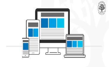
Responsive layouts possess the ability to automatically adjust and adapt to different device screen sizes, whether it's a desktop, laptop, tablet, or mobile phone. This adaptability is illustrated below.
Creating Responsive Layout with Bootstrap
Thanks to Bootstrap's powerful mobile-first flexbox grid system, creating responsive and mobile-friendly websites and applications has become significantly easier.
Bootstrap inherently embraces responsiveness and mobile-friendliness right from the start. Its six-tier grid classes provide excellent control over the layout and its rendering on various devices, including mobile phones, tablets, laptops, desktops, and larger screens.
In the provided example, a responsive layout is showcased with varying column arrangements based on different device sizes. On extra-large devices (viewport ≥ 1200px), the layout will display as a four-column arrangement. For large devices (992px ≤ viewport < 1200px), it will be presented as a three-column layout. On medium devices (768px ≤ viewport < 992px), the layout adapts to a two-column arrangement, while on small and extra-small devices (viewport < 768px), it transforms into a one-column layout.
<div class="container-fluid">
        <a href="#" class="navbar-brand">simmanchith.com</a>
        <button type="button" class="navbar-toggler" data-bs-toggle="collapse" data-bs-target="#navbarCollapse">
            <span class="navbar-toggler-icon"></span>
        </button>
        <div class="collapse navbar-collapse" id="navbarCollapse">
            <div class="navbar-nav">
                <a href="#" class="nav-item nav-link active">Home</a>
                <a href="#" class="nav-item nav-link">Services</a>
                <a href="#" class="nav-item nav-link">About</a>
              	<a href="#" class="nav-item nav-link">Contact</a>
            </div>
Tip: To observe how this responsive behavior functions, you can open the output of this example in a new blank window by clicking the New Window link within the CodeLab editor. As you resize the screen, you'll notice that the content boxes' orientation changes when the viewport width reaches or approaches specific breakpoints.
FAQ
What is Bootstrap's responsive layout system?
Bootstrap's responsive layout system is a set of CSS classes and rules that enable developers to create web pages that adapt and adjust their appearance based on the screen size and device type. This ensures that websites built with Bootstrap look and function well on various devices, such as desktops, tablets, and smartphones.
How does Bootstrap's responsive layout system work?
Bootstrap's responsive layout system works by utilizing a grid-based structure. It is divided into 12 equal columns across the page width. Developers can then assign these columns to various content elements, such as text, images, and widgets, by using specific classes. Depending on the screen size, these columns will automatically adjust their width to maintain a consistent and visually appealing layout.
What are the key components of Bootstrap's responsive layout system?
The key components of Bootstrap's responsive layout system include:
- Grid System: The grid system consists of rows and columns. Rows are horizontal containers, and columns are placed inside them. Developers use classes like
col-xs,col-sm,col-md, andcol-lgto define how many columns an element should occupy at different screen sizes. - Responsive Breakpoints: Bootstrap provides predefined breakpoints based on common device sizes. These include
xs(extra small),sm(small),md(medium), andlg(large). Developers use these breakpoints to define how elements should behave on various devices. - Responsive Classes: Bootstrap offers classes like
hidden-xs,hidden-sm, etc., to hide or show elements based on screen sizes. For example,hidden-xswill hide an element on extra-small screens. - Viewport Meta Tag: Including the viewport meta tag in the HTML
<head>section is essential. This tag ensures that the website adapts to the device's screen width and adjusts the initial zoom level.
Can you provide an example of creating a responsive layout using Bootstrap?
Here's a basic example of creating a responsive two-column layout using Bootstrap:
<div class="container">
    <div class="row">
      <div class="col-sm-6 col-xs-12">
        <h2>Column 1</h2>
        <p>This is the left column content.</p>
      </div>
      <div class="col-sm-6 col-xs-12">
        <h2>Column 2</h2>
        <p>This is the right column content.</p>
      </div>
    </div>
  </div>
In this example, the columns will stack vertically on extra-small screens (col-xs-12) and appear side by side on small screens and above (col-sm-6).
What are the benefits of using Bootstrap's responsive layout system?
Bootstrap's responsive layout system offers several benefits:
- Consistency: It helps maintain a consistent user experience across different devices, which is essential for user satisfaction.
- Time Savings: Developers don't need to write custom CSS for each screen size, saving development time.
- Flexibility: Content adapts automatically to various screen sizes, reducing the need for manual adjustments.
- Mobile-First: Bootstrap's responsive design is built with a mobile-first approach, improving performance on mobile devices.
- Cross-Device Compatibility: Websites built with Bootstrap's responsive layout work well on a wide range of devices, from smartphones to large desktops.
How does Bootstrap handle images in a responsive layout?
Bootstrap provides the .img-fluid class for images to ensure they resize proportionally within their parent containers. This class is particularly useful for responsive images that need to adjust to different screen sizes.
<img src="path/to/image.jpg" alt="Responsive Image" class="img-fluid">
How can you create a responsive background image using Bootstrap?
You can create a responsive background image using the background-image CSS property along with the bg-* classes in Bootstrap. These classes apply background images that scale proportionally with the container.
<div class="bg-image bg-image-responsive">
  <!-- Content goes here -->
</div>
.bg-image {
  background-image: url('path/to/image.jpg');
  background-size: cover;
  background-position: center;
}

.bg-image-responsive {
  padding-bottom: 56.25%; /* Maintain aspect ratio for 16:9 images */
}
How do you handle responsive typography in Bootstrap?
Bootstrap's typography classes automatically adjust the font size based on screen size. For example, you can use text-xs, text-sm, text-md, and text-lg classes to apply different font sizes.
<p class="text-lg">Large text on larger screens</p>
<p class="text-md">Medium text on medium screens</p>
<p class="text-sm">Small text on small screens</p>
<p class="text-xs">Extra small text on extra small screens</p>
What is the purpose of the Bootstrap utility classes for spacing?
Bootstrap provides utility classes for controlling spacing within elements. These classes include mt-* (margin top), mb-* (margin bottom), ml-* (margin left), mr-* (margin right), pt-* (padding top), pb-* (padding bottom), pl-* (padding left), and pr-* (padding right). They help maintain consistent spacing and responsiveness.
<div class="mt-3 mb-3">This element has top and bottom margin</div>
<div class="p-4">This element has all-around padding</div>
How can you create a responsive, centered content block using Bootstrap?
To create a responsive, centered content block, you can use the mx-auto class along with responsive column classes. This centers the block horizontally within its container.
<div class="container">
  <div class="row">
    <div class="col-lg-6 mx-auto">
      <p>This content block is centered on large screens.</p>
    </div>
  </div>
</div>
How can you create a responsive card layout with Bootstrap?
You can create responsive card layouts using Bootstrap's Card component. Cards are versatile containers for displaying content. To make them responsive, use the card-columns class to create a masonry-like grid that adjusts based on screen width.
<div class="card-columns">
  <div class="card">
    <img src="image.jpg" class="card-img-top" alt="Image">
    <div class="card-body">
      <h5 class="card-title">Card Title</h5>
      <p class="card-text">Card content goes here.</p>
    </div>
  </div>
  <!-- More cards... -->
</div>
How can you handle responsive tables with Bootstrap?
Bootstrap provides a class table-responsive to make tables scroll horizontally on smaller screens. This prevents tables from breaking the layout.
<div class="table-responsive">
  <table class="table">
    <thead>
      <tr>
        <th>#</th>
        <th>First Name</th>
        <th>Last Name</th>
      </tr>
    </thead>
    <tbody>
      <tr>
        <td>1</td>
        <td>John</td>
        <td>Doe</td>
      </tr>
      <!-- More rows... -->
    </tbody>
  </table>
</div>
How can you create a responsive carousel using Bootstrap?
You can create responsive carousels using Bootstrap's Carousel component. Make sure to include the necessary carousel and carousel-inner classes for structure and styling.
<div id="myCarousel" class="carousel slide" data-ride="carousel">
  <div class="carousel-inner">
    <div class="carousel-item active">
      <img src="slide1.jpg" class="d-block w-100" alt="Slide 1">
    </div>
    <div class="carousel-item">
      <img src="slide2.jpg" class="d-block w-100" alt="Slide 2">
    </div>
    <!-- More slides... -->
  </div>
  <a class="carousel-control-prev" href="#myCarousel" role="button" data-slide="prev">
    <span class="carousel-control-prev-icon" aria-hidden="true"></span>
    <span class="sr-only">Previous</span>
  </a>
  <a class="carousel-control-next" href="#myCarousel" role="button" data-slide="next">
    <span class="carousel-control-next-icon" aria-hidden="true"></span>
    <span class="sr-only">Next</span>
  </a>
</div>
How can you customize Bootstrap's responsive behavior based on your project's needs?
While Bootstrap provides predefined responsive breakpoints, you can customize these breakpoints by modifying the CSS variables (Bootstrap 5) or Sass variables (Bootstrap 4) that define them. You can also override Bootstrap's default styles to match your project's design.
For instance, in Bootstrap 5, to customize the breakpoints, modify the CSS variables:
:root {
  --bs-breakpoint-sm: 480px; /* Modify the small breakpoint */
  --bs-breakpoint-md: 768px; /* Modify the medium breakpoint */
  /* ... other breakpoints ... */
}
How can you create a responsive video embedding using Bootstrap?
To embed responsive videos, you can use Bootstrap's utility class embed-responsive along with a specific aspect ratio class like embed-responsive-16by9 or embed-responsive-4by3.
<div class="embed-responsive embed-responsive-16by9">
  <iframe class="embed-responsive-item" src="https://www.youtube.com/embed/your-video-id"></iframe>
</div>
This ensures that the embedded video maintains its aspect ratio and adjusts to different screen sizes.
Can you explain Bootstrap's approach to responsive typography units?
Bootstrap 4 introduced responsive typography units based on CSS calc(). These units allow you to set font sizes that adjust according to the screen width. For example, you can use 1vw to set the font size to 1% of the viewport width.
.font-responsive {
  font-size: calc(1rem + 1vw);
}
This approach results in text that scales slightly with the screen size while maintaining readability.
How can you handle responsive images that require different sizes for different screen resolutions?
Bootstrap 5 introduced the image-set() function to handle responsive images with varying resolutions. This function lets you define multiple image sources with different resolutions and their associated media conditions.
.responsive-image {
  background-image: image-set(
    "image.jpg" 1x,
    "image@2x.jpg" 2x,
    "image@3x.jpg" 3x
  );
}
This ensures that devices with different pixel densities are served the appropriate image.
Conclusion
Bootstrap is an invaluable tool for achieving responsive web design that caters to today's diverse range of devices. This approach ensures that your design remains mobile-friendly and easily adapts to the ever-changing landscape of screen sizes and resolutions. The result is a layout that adjusts to screen sizes, providing a seamless user experience on various devices.
Cross-device compatibility is a hallmark of Bootstrap's design philosophy, allowing you to create a layout that works on all devices effortlessly. By leveraging Bootstrap's grid for responsiveness, you can ensure your design remains adaptable and visually appealing. Bootstrap facilitates a responsive layout with a mobile-first design approach, which prioritizes the user experience on smaller screens and gradually expands to larger devices. The responsive grid enables your layout to remain consistent and user-friendly.
You can fine-tune your design to accommodate various screen resolutions and provide a consistent user experience across different devices. Bootstrap's focus on design for multiple devices ensures that your content and layout remain accessible and functional, regardless of the platform. Moreover, Bootstrap's fluid layout principles ensure cross-browser compatibility, making your design consistently accessible to users across various web browsers.
Whether you're developing a responsive form with Bootstrap, ensuring responsive navbar design, or optimizing responsive image design, the framework provides the necessary tools to create adaptable and visually appealing components. By utilizing form layout with responsiveness, responsive form elements, or adaptive image display, you can create designs that work seamlessly on all devices, delivering a smooth and engaging user experience.