CSS Alignment
Embark on a journey into the heart of web design as we unravel the secrets of achieving perfect alignment with CSS. Today, we focus on the fundamentals of design, exploring techniques on how to center a div, align text effortlessly, and master the delicate art of left and right alignment. From the basics of CSS text positioning to the magic of centering a div with margin, we've got your toolkit ready. Whether you're a novice coder or a seasoned developer, join us as we demystify the intricacies of CSS alignment.
Text Alignment
Properly adjusting the text-align property enables the alignment of text within block-level elements.
h1 {
    text-align: center;
}
p {
    width: 350px;
    text-align: justify;
}
Center Alignment Using the margin Property
An essential application of the CSS margin property is center aligning block-level elements. For instance, by setting the left and right
margins to auto, the <div> container can be horizontally centered.
div {
    width: 70%;
    margin: 0 auto;
}
The style rules provided in the above example ensure horizontal center alignment of the <div> element.
Note: The value auto for the margin property may not work in Internet Explorer 8 and earlier versions unless a <!DOCTYPE> is specified.
Aligning Elements Using the position Property
CSS positioning, in combination with theleft, right, top, and
bottom properties, can be utilized to align elements relative to the viewport or their containing parent element.
.up {
    background: yellow;
    position: absolute;
    top: 0;

}
.down {
    background: purple;
    position: absolute;
    bottom: 0;
}
Left and Right Alignment Using the float Property
The float CSS property allows an element to be aligned to the left or right of its containing block, enabling other content to flow
alongside it.
Consequently, if an element is floated to the left, content will flow along its right side. Similarly, if the element is floated to the right, content will flow along its left side.
div.red {
    float: left;
    background: #ff0000;
}
div.green {
    float: right;
    background: #00ff00;
}
Clearing Floats
Working with float-based layouts often presents challenges, particularly with the collapsing parent issue. The parent element does not automatically expand to accommodate the floated elements. This behavior may not be apparent if the parent lacks visually noticeable background or borders. However, it is crucial to be aware of this issue and address it to prevent layout problems and cross-browser compatibility issues. Please refer to the illustration below:
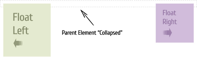
In the provided example, the <div> element does not automatically stretch to accommodate the floated images. This issue can be
resolved by clearing the float after the floated elements within the container, just before the closing tag of the container element.
Fixing the Collapsed Parent
Multiple solutions exist to resolve the CSS collapsing parent issue. The following section will describe these solutions along with live examples.
Solution 1: Float the Container
A convenient solution to address this issue is to float the parent element that contains the problem.
.container {
    float: left;
    background: #f2f2f2;
}
Warning: However, it's important to note that this fix has limitations and may lead to unexpected outcomes in certain situations.
Solution 2: Using the Empty Div
Although it may be considered an old-fashioned approach, floating the parent element is an easy and universally compatible solution.
.clearfix {
    clear: both;
}
/* html code snippet */
<div class="clearfix"> </div>
Another method to tackle this problem involves using a <br> tag. However, this technique is not recommended since it adds nonsemantic code to your markup.
Solution 3: Using the :after Pseudo-Element
To resolve float-clearing issues, the :after pseudo-element combined with the content property has been widely employed. This approach has proven to be quite effective.
.clearfix:after {
    content: ".";
    display: block;
    height: 0;
    clear: both;
    visibility: hidden;
}
The class .clearfix is typically assigned to any container that contains floating children.
FAQ
What is CSS alignment, and why is it important in web development?
CSS alignment refers to the positioning and arrangement of elements on a web page to achieve a desired layout. It is vital in web development as it enables developers to control the placement of content elements, ensuring an appealing and user-friendly interface.
What are the different CSS alignment properties, and what are their purposes?
There are several CSS alignment properties:
text-align:Controls the horizontal alignment of text within a block-level element.vertical-align:Aligns inline or inline-block elements vertically within their containers.margin:Adjusts the margins of an element to control its alignment with respect to other elements.position:When set toabsoluteorfixed, allows precise positioning relative to the nearest positioned ancestor.justify-contentandalign-items:Primarily used in CSS Flexbox and Grid layouts to control the alignment of items both horizontally and vertically within a container.
How does the text-align property work, and what are its possible values?
The text-align property controls the horizontal alignment of text within a block-level element. It can have these values:
left:Aligns text to the left edge of the container.right:Aligns text to the right edge of the container.center:Centers text within the container.justify:Justifies text, causing it to spread evenly across the container.
What does the vertical-align property do, and how is it applied to inline elements?
The vertical-align property aligns inline or inline-block elements vertically within their containing elements. Its values include:
baseline:Aligns the element's baseline with the parent element's baseline.top:Aligns the top of the element with the tallest element in the line.middle:Aligns the middle of the element with the line's middle.bottom:Aligns the bottom of the element with the lowest element in the line.
How can you horizontally center a block-level element within its parent container using CSS?
To horizontally center a block-level element, you can use these methods:
- Set
margin-leftandmargin-righttoautoand specify a width for the element. - Use
text-align: centeron the parent container and set the element'sdisplayproperty toinline-block.
How can you center an element both horizontally and vertically within its container using CSS?
To center an element both horizontally and vertically within its container, you can use the following CSS techniques:
- Using Flexbox: Set the parent container's
displayproperty toflex, and use bothjustify-content: centerandalign-items: centerto center the child element both horizontally and vertically. - Using Grid: In a grid container, you can use the
place-items: centershorthand property to center the child element both horizontally and vertically. - Using the position property: Set the child element's
positiontoabsolute, and then usetop: 50%andleft: 50%along withtransform: translate(-50%, -50%)to center it both horizontally and vertically within a relative parent.
When should you use margin: 0 auto; for centering a block-level element, and what does it do?
The margin: 0 auto; for centering a block-level element horizontally when you want to center it within its parent container. This CSS rule sets the top and bottom margins to 0 and automatically calculates equal left and right margins, effectively horizontally centering the element.
How can you create a responsive centering effect where an element adjusts its alignment based on its parent's size using CSS?
To create a responsive centering effect, you can use a combination of position and CSS transforms:
- Set the child element's
positiontoabsolute. - Use
top: 50%;andleft: 50%;to position it in the center of its parent. - Apply
transform: translate(-50%, -50%);to adjust its position so that it's perfectly centered, regardless of the parent's size.
This technique ensures the element remains centered as the parent resizes.
How can you horizontally align an image within a div while keeping the image's original aspect ratio using CSS?
To horizontally align an image within a div while preserving its original aspect ratio, you can use the following CSS rules:
.container {
    text-align: center; /* Center-align the content horizontally */
}

.image {
    max-width: 100%; /* Ensure the image doesn't exceed the container's width */
    height: auto; /* Maintain the original aspect ratio */
    display: inline-block; /* Keep the image inline for horizontal alignment */
}
Conclusion
CSS Alignment provides developers with a powerful set of tools for precisely positioning and aligning elements within a
webpage. With properties like text-align, vertical-align, and
justify-content designers can control the alignment of text, images, and other elements horizontally and vertically.
CSS Alignment allows for creating visually balanced and harmonious layouts, ensuring consistent spacing and readability.
Additionally, it plays a crucial role in
responsive design, allowing elements to adapt and align appropriately across different screen sizes. By leveraging the capabilities of
CSS Alignment, developers can achieve professional and visually appealing designs that enhance the overall user experience.
In wrapping up our exploration, you've now discovered the power of CSS in achieving design perfection. Mastering how to center a div, aligning text with precision, and gracefully handling left and right alignments are fundamental skills every web designer should possess. Armed with the knowledge of CSS horizontal and vertical alignment, along with the nuances of aligning items and div content, you're well-equipped to create visually stunning and well-balanced web layouts. Cheers to a future filled with beautifully aligned designs!