CSS Border
Welcome to the realm of web design, where the details matter. Today, we explore the art of CSS borders—the versatile tool that adds structure and visual appeal to web elements. From various border types in CSS to the finesse of border style and customization through CSS border properties, this journey unlocks the potential to create visually captivating designs. Dive into the subtleties of border width, thickness, and color, and discover the elegance of rounded borders, offering a glimpse into the nuanced world of CSS aesthetics. Let's explore how these elements come together to transform your web design with sophistication and flair.
CSS Border Properties
The CSS border properties allow you to specify the appearance of an element's border area. Borders are positioned between the margin and padding of an element. They can be defined with predefined styles such as solid lines, dotted lines, double lines, or even with images.
The following section explains how to customize the style, color, and width of the border.
Understanding the Different Border Styles
The border-style property determines the style of the border for all four sides of the element. It can be set to values like
solid, dotted, and others, and serves as a shorthand property for setting the line style.
Some of the border-style values include none, hidden, solid, dashed, dotted, double, inset, outset, groove, and ridge. To better understand the distinctions between these styles, refer to the accompanying illustration.
The values none and hidden both result in no visible border, but there is a subtle difference between them. In cases of table cells and border collapsing, the none value has the lowest priority, while the hidden value has the highest priority if conflicting borders are present.
The values inset, outset, groove, and ridge create a 3D effect that depends on the specified border-color value. This effect is typically achieved by employing two shades, slightly lighter and darker than the border color, to create a "shadow." Let's explore an example to see it in action.
<style>
p {
    border-width: 20px;
    background: skyblue;
    padding: 25px;
    margin: 25px;
}
p.none {
    border-style: none;
}
p.hidden {
    border-style: hidden;
}
p.dotted {
    border-style: dotted;
}
p.dashed {
    border-style: dashed;
}
p.solid {
    border-style: solid;
}
</style>
Note :- To make a border appear around an element, you need to specify a border style since the default style is "none." However, the default border width is
medium, and the default border color is the same as the text color.
Setting the Border Width
The border-width property allows you to determine the thickness of the border area. It can be used as a shorthand property to set the
same thickness for all four sides of the element's border simultaneously. To further understand how it works, consider the following example:
<style>
p {
    border-style: solid;
    padding: 25px;
    margin: 25px;
}
p.one {
    border-width: 7px;
}
p.two {
    border-width: 7px 13px;
}
p.three {
    border-width: 7px 13px 17px;
}
p.four {
    border-width: medium 15px thick 20px;
}
</style>
Tip: In the provided example, the border width can be specified using various length units like pixels (px), ems (em), rems (rem), etc. Alternatively, you can
use the keywords thin, medium, and thick to set the border width.
However, percentage values are not permitted.
Specifying the Border Color
The border-color property determines the color of the border area. It also serves as a shorthand property to set the same color for all
four sides of the element's border. The given style rules demonstrate the addition of a solid red border around paragraphs.
<style>
p {
    border-width: 15px;
    padding: 20px;
    margin: 20px;
}
p.one {
    border-style: solid;
    border-color: blue;
}
p.two {
    border-style: solid;
    border-color: purple yellow;
}
</style>
Note: It's important to note that the border-width or border-color property won't
work if used alone. First, you need to set the border style using the border-style property.
The Border Shorthand Property
The border CSS property is a convenient way to set multiple individual border properties, such as
border-width, border-style, and border-color, in a single rule.
In the provided example, we can observe how this shorthand property works:
<style>
p {
    border: 7px solid purple;
	background: yellow;
    padding: 25px;
    margin: 25px;
}
</style>
If you omit or don't specify a value for an individual border property while setting the border shorthand property, the default value for that property (if any) will be used instead.
For example, if you don't provide a value for the border-color property when setting the border, the element's ,
color property will be used as the value for the border color. In the given example, a solid red line with a width of 5 pixels will be
displayed as the border:
<style>
p {
    color: orange;
	background: green;
    border: 7px solid;
    padding: 25px;
    margin: 25px;
}
</style>
If you do not specify a value for the border-style property, no border will be displayed. This is because the default value for
border-style is none. In the provided example, when the border-style value is omitted, there will
be no visible border.
<style>
p {
    border: 10px purple;
    background: orange;
    padding: 25px;
    margin: 25px;
}
</style>
Using CSS3 Borders
CSS3 introduces two new properties that offer enhanced options for styling borders: border-image and
border-radius.
Creating CSS3 Borders with Rounded Corners
The border-radius property is used to create rounded corners without the need for images. In the past, sliced images were often used to
achieve rounded corners, which could be cumbersome.
With border-radius you can define the shape of the corners on the outer border edge, resulting in elegant and smooth rounded corners.
<style>
.box {
	width: 310px;
	height: 160px;
	background: skyblue;
	border: 4px solid orange;
	border-radius: 25px;
}
</style>
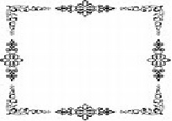
Adding CSS3 Border Images
The border-image property allows you to use an image as the border of an element. By specifying the image URL in the
border-image property, you can create unique border designs using the sides and corners of the image. The border image can be sliced,
repeated, scaled, and stretched to fit the size of the border area.
The border design is constructed by combining the sides and corners of the image supplied in the border-image source URL. To match the size
of the border image area, the border picture can be cut, duplicated, resized, and stretched in numerous ways.
<style>
.box {
	width: 310px;
	height: 140px;
	border: 16px solid transparent;
	-webkit-border-image: url("border.png") 30 30 round; /* Safari 3.1-5 */
	-o-border-image: url("border.png") 30 30 round; /* Opera 11-12.1 */
	border-image: url("border.png") 30 30 round;
}
</style>
Note: In the "border-image" property, the "round" option is a variation of the "repeat" option. It ensures that the image tiles are distributed in a way that creates a smooth connection between the ends of the border
FAQ
What is the CSS border property used for?
The CSS border property is used to define the border around an element in a web page. It allows you to control the style, width, and color of the border.
What are the individual components of the border property?
The border property consists of three main components:
- Border Width: This defines the thickness of the border, and it can be set using values like pixels, ems, rems, or percentages.
- Border Style: This specifies the style of the border, such as solid, dashed, dotted, double, etc.
- Border Color: This determines the color of the border, and you can use named colors, hexadecimal values, RGB values, or HSL values.
What are the different border styles available in CSS3?
CSS3 provides several border styles, including:
solid: Creates a solid line.dotted: Creates a series of small dots.dashed: Creates a series of short dashes.double: Creates two parallel lines.groove: Creates a 3D, grooved border.ridge: Creates a 3D, ridged border.inset: Creates a 3D, inset border.outset: Creates a 3D, outset border.
You can set the border style using the border-style property.
How can you set the border of an element to have a specific width, style, and color simultaneously?
You can set the border of an element using the shorthand border property, like this:
border: 2px solid #333;
In this example, the border will have a width of 2 pixels, a solid style, and a color of #333 (dark gray).
How can you set different borders for each side of an element (top, right, bottom, left)?
To set different borders for each side of an element, you can use the properties border-top, border-right, border-bottom, and border-left. For example:
border-top: 1px dashed blue;
border-right: 2px dotted green;
border-bottom: 3px solid red;
border-left: 4px double orange;
This will apply different border styles to each side of the element.
How can you remove a border from a specific side of an element?
You can remove a border from a specific side of an element by setting the corresponding border property to none. For example, to remove the left border:
border-left: none;
What is the border-image property in CSS3, and how does it work?
The border-image property in CSS3 allows you to use an image as the border instead of a solid color or style. It works by specifying an image to be used as the border and then defining how that image should be sliced and repeated to create the border.
border-image: url(border.png) 30 30 round;
This code sets the border-image to "border.png," slices the image into 30-pixel sections, and rounds the corners.
What is the purpose of the border-radius property in CSS?
The border-radius property is used to create rounded corners for an element's border. It takes one or more values that determine the radius of the corners. For example:
/* All corners have a radius of 10px */
border-radius: 10px;
/* Top-left and bottom-right corners have a radius of 10px, while top-right and bottom-left corners have a radius of 20px */
border-radius: 10px 20px;
/* Top-left, top-right, bottom-right, and bottom-left corners have different radius */
border-radius: 10px 20px 30px 40px;
How can you create a dashed border with alternating colors using CSS?
To create a dashed border with alternating colors, you can use the border property along with the border-image property. Here's an example:
border: 2px dashed transparent; /* Set the border style and width */
border-image: linear-gradient(90deg, red, blue) 1; /* Apply a gradient as the border image */
In this example, the border will be dashed with alternating red and blue segments.
How can you specify different border widths for each side of an element using the shorthand property?
You can use the shorthand border-width property along with the border property to specify different border widths for each side of an element. For example:
border: 2px 3px 4px 5px solid #999;
In this example, the top border will be 2px, the right border will be 3px, the bottom border will be 4px, and the left border will be 5px, all with a solid style and a color of #999.
How can you create a border that is only visible on one side of an element in CSS3?
To create a border that is only visible on one side of an element in CSS3, you can use specific border properties for that side while setting others to none. For example, to create a border on the top side:
border-top: 2px solid blue;
border-right: none;
border-bottom: none;
border-left: none;
In this code, we set the border-top property to create a blue border on the top side, and the other sides are set to none to remove their borders.
How can you create a border that is partially transparent in CSS3?
To create a partially transparent border in CSS3, you can use the border-color property with an RGBA color value. Here's an example:
border: 2px solid rgba(255, 0, 0, 0.5); /* Red border with 50% transparency */
In this code, the RGBA color value (in this case, red with an alpha value of 0.5) makes the border partially transparent.
How can you create a shadow-like effect around an element using only CSS borders?
You can create a shadow-like effect around an element by using multiple borders with different colors and widths. Here's an example:
border: 5px solid #333;
border-top: 1px solid #666;
border-left: 1px solid #666;
In this example, the element will have a primary border of 5px and a slightly lighter border on the top and left sides, creating a shadow illusion.
How can you create a border image that repeats around an element's border using CSS?
You can create a repeating border image using the border-image property. By using the border-image-source and border-image-repeat properties, you can specify the image source and how it should repeat. For example:
border: 10px solid transparent;
border-image-source: url(border-image.png);
border-image-repeat: repeat;
In this case, the border-image.png will be repeated to create the border.
What is the border-image-repeat property used for in CSS3?
The border-image-repeat property in CSS3 is used to control how the border image is repeated or stretched to fill the border area. It has values like stretch, repeat, round, and space.
stretch: The image is stretched to cover the entire border area.repeat: The image is repeated as many times as needed to cover the border area.round: The image is repeated, but the last repetition is scaled to fit the remaining space.space: Similar toround, but the last repetition is not scaled.
How can you make an element's border appear as a dashed line with rounded ends?
You can create a dashed line border with rounded ends using the border property along with the border-radius property for the rounded ends. Here's an example:
border: 2px dashed #999;
border-radius: 10px; /* Adjust the radius as needed */
This will create a dashed line border with rounded corners.
Conclusion
In the realm of web design, the versatility of CSS borders emerges as a fundamental tool, shaping the visual appeal of elements. Our journey through the intricacies of border types in CSS, exploring diverse styles with CSS border style, and customizing properties using CSS border properties has been illuminating.
From fine-tuning the border width to selecting the perfect border thickness and accentuating with a splash of border color, the details matter in crafting a polished design. Whether it's defining a sharp outline or experimenting with the softness of curved edges in CSS, the border attribute plays a pivotal role.
The integration of border images in CSS and the creative possibilities with image borders showcase the dynamic nature of design. Picture-perfect details emerge with the delicate touch of CSS rounded borders and the seamless elegance of rounded corners.
CSS border is a versatile feature for adding visual structure to webpage elements. Utilize border properties and CSS3 border features to control thickness, style, color, and advanced options like rounded corners and gradients. Apply these properties to elements such as divs, images, buttons, allowing for creative and visually appealing designs. Explore the potential of CSS3 borders to elevate your website's overall aesthetics with unique and eye-catching border effects.