CSS Fonts
Explore the exciting world of making websites look great, where CSS helps in changing how text appears. CSS lets you choose different fonts, like families, types, and styles, making text look cool. You can also change the size, weight, and style of text to make it consistent and good-looking. CSS works smoothly with HTML, tweaking how text looks, and picking the right font family is easy. This makes your website design better, with cool and attractive text styles.
Styling Fonts with CSS
Choosing the appropriate font and style is essential for ensuring the legibility of text on a page. CSS provides various properties for
styling text fonts, including options to change the font face, control the size and boldness, manage
variations, and more.
The font properties available are: font-family, font-style,
font-weight, font-size, and font-variant. Let's explore each of
these font properties in more detail.
Font Family
The font-family property is used to specify the font to be used for rendering the text. This property can include multiple font names
separated by commas, serving as fallback options. If the first font isn't available on the user's system, the browser will try the second, and so on.
The list should end with a generic font family, such as serif, sans-serif,
monospace, cursive, or fantasy. A typical font family declaration
would look like this:
<style>
body {
    font-family: Arial, Helvetica,sans-serif;
}
</style>
If a font family name consists of more than one word, it must be enclosed in quotation marks, like "Times New Roman", "Courier New", "Segoe UI", etc.
The most commonly used font families in web design are "serif" and "sans-serif", as they are more suitable for readability. "Monospace" fonts are often employed to display code since each letter occupies the same amount of space, resembling typewritten text.
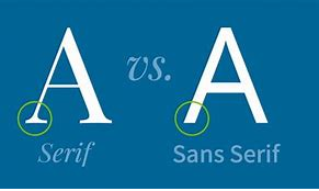
Difference Between Serif and Sans-serif Fonts
Serif fonts feature small lines or strokes at the extremities of characters, while sans-serif fonts are more straightforward without these additional strokes. Refer to the following illustration:
For commonly used font combinations, you can consult references on web-safe fonts.
Font Style
The font-style property determines the style of the font face for the text content of an element. The font style can be
normal, italic, or oblique. The default value is
normal.
Let's examine the following example to grasp the basic functionality:
<style>
p.normal {
    font-style: normal;
}
p.italic {
    font-style: italic;
}
p.oblique {
    font-style: oblique;
}
</style>
At first glance, italic and oblique font styles may appear similar, but they have a distinction.
The italic style employs an italicized version of the font, whereas the oblique style simply slants or slopes the normal font.
Font Size
The font-size property is used to set the size of the font for the text content of an element. You can specify font size values in various
ways, such as keywords, percentages, pixels, ems, etc.
Setting Font Size with Pixels
Using pixel values (e.g., 14px, 16px) for font izes is appropriate when precise pixel accuracy is required. Pixels are absolute units of measurement that denote fixed lengths.
Let's consider the following example to understand its basic functioning:
<style>
h1 {
    font-size: 30px;
}
p {
    font-size: 15px;
}
</style>
Defining font sizes in pixels is not considered highly accessible because users cannot adjust the font size from their browser settings. Users with limited or low vision may prefer a significantly larger font size than what is specified.
To create an inclusive design, it is advisable to avoid using pixel values and instead use values relative to the user's default font size. Text can also be resized in all browsers using the zoom feature, but this resizes the entire page, not just the text. The W3C recommends utilizing em or percentage (%) values to establish more robust and scalable layouts.
The em unit refers to the font size of the parent element. When defining the font-size property, 1em corresponds to the
font size applied to the parent element.
Setting Font Size with EM
The font-size of the parent element is measured in em. 1em is the size of the font that
applies to the element's parent when establishing the font-sizeattribute.
For instance, if you set a font size of 20px on the body element, then 1em = 20px and 2em = 40px. If no font size is set anywhere on the page, the default size is typically 16px in most browsers. Thus, by default, 1em = 16px, and 2em = 32px.
Take a look at the following example to grasp its basic functionality:
<style>
h1 {
    font-size: 2em;    /* 32px/16px=2em */
}
p {
    font-size: 0.875em;    /* 14px/16px=0.875em */
}
</style>
Using the Combination of Percentage and EM
Calculating em values might not appear straightforward based on the above example. To simplify this, a popular technique involves setting the
font-size for the body element to 62.5% (equivalent to 62.5% of the default 16px), resulting in 10px or 0.625em.
With this approach, you can set font sizes for other elements using em units, employing an easily memorable conversion by dividing the pixel value by 10. Consequently, 10px = 1em, 12px = 1.2em, 14px = 1.4em, 16px = 1.6em, and so on. Observe the following example:
<style>
body {
    font-size: 62.5%;    /* font-size 1em = 10px */
}
p {
    font-size: 1.4em;    /* 1.4em = 14px */
}
p span {
    font-size: 2em;    /* 2em = 28px */
}
</style>
Setting Font Size with Root EM
To simplify further, CSS3 introduced the rem unit (short for "root em"), which remains relative to the font size of the root element
(<html>), irrespective of where the element appears in the document (unlike em, which relates to the parent element's font size).
Therefore, 1rem corresponds to the font size of the html element, which defaults to 16px in most browsers. Consider the following
example to understand its functionality:
<style>
html {
    font-size: 62.5%;    /* font-size 1em = 10px */
}
body {
    font-size: 1.6rem;    /* 1.6rem = 16px */
}
p {
    font-size: 1.4rem;    /* 1.4rem = 14px */
}
p span {
    font-size: 2rem;    /* 2rem = 20px (not 28px) */
}
</style>
Setting Font Size with Keywords
CSS provides several keywords to specify font sizes.
Absolute font sizes can be specified using the following keywords: xx-small, x-small,
small, medium, large, x-large,
xx-large. Relative font sizes can be specified using the keywords smaller or larger.
Explore the following example to see it in action:
<style>
body {
    font-size: X-large;
}
h1 {
    font-size: larger;
}
p {
    font-size: smaller;
}
</style>
Note: The keyword medium equates to the browser's default font size, typically 16px. Similarly, xx-small corresponds to
9 pixels, x-small to 10 pixels, small to 13 pixels, large to 18
pixels, x-large to 24 pixels, and xx-large to 32 pixels.
Tip: By setting a font size on the body element, you can establish relative font sizing throughout the page, allowing easy scaling of the font size up or down as needed.
Setting Font Size with Viewport Units
Font sizes can also be specified using viewport units, such as vw or vh.
Viewport units refer to a percentage of the browser's viewport dimensions, where 1vw = 1% of viewport width and 1vh = 1% of viewport height. Thus, if the viewport is 1600px wide, 1vw would be 16px.
Experiment with the following example by resizing the browser window to observe its behavior:
<style>
body {
    font-size: 2vw;
}
h1 {
    font-size: 5vw;
}
</style>
However, using viewport units can lead to fonts becoming excessively small on small screens, making them difficult to read. To address this, you can utilize the CSS
calc() function, as shown below:
<style>
html {
    font-size: calc(1em + 2vw);
}
h1 {
    font-size: 2rem;
}
</style>
In this example, even if the viewport width becomes zero, the font size will be at least 1em or 16px.
Font Weight
The font-weight property specifies the weight or boldness of the font.
This property accepts the following values: normal, bold, bolder, lighter, 200, 300, 400, 500, 600, 700, 800, 900, and inherit.
- The numeric values
100-900denote specific font weights, with each number representing a weight greater than its predecessor.400is equivalent to normal, while700is equivalent to bold. - The values bolder and lighter are relative to the inherited font weight, while normal and bold are absolute font weights.
Explore the following example to understand how this property functions:
<style>
p {
    font-weight: italic;
}
</style>
Note: Most fonts are available in only a limited number of weights, often limited to normal and
bold. If a font is unavailable in the specified weight, an alternative font will be chosen that closely matches the desired weight.
Font Variant
The font-variant property allows displaying the text in a special small-caps variation.
Small caps feature lowercase letters appearing as smaller versions of choosing the appropriate font and style is crucial to ensure that text on a page is easy to read.
Try out the following example to see how it works:
<style>
p {
    font-variant: small-caps;
}
</style>
FAQ
What is the font-family property in CSS?
The font-family property in CSS is used to specify the typeface or font family for the text content within an element. It determines how the text should be displayed in terms of its font style. Multiple font families can be listed as a fallback sequence, allowing the browser to select the first available font in case the preferred font isn't available on the user's system.
For example, to set the font family of a paragraph to "Arial" and use "Helvetica" as a fallback if Arial is not available, you would use the following CSS rule:
p {
  font-family: "Arial", "Helvetica", sans-serif;
}
How does the font-size property work in CSS?
The font-size property in CSS controls the size of the text within an element. It can be set using various units such as pixels (px), em units (em), percentages (%), or relative units like rem (root em) and vw (viewport width).
For instance, to set the font size of a heading to 24 pixels, you would use:
h1 {
  font-size: 24px;
}
What is the purpose of the font-weight property in CSS?
The font-weight property is used to control the thickness or boldness of the text characters. It accepts values ranging from 100 (thin) to 900 (bold), and also includes named values like normal, bold, bolder, and lighter.
To make a paragraph's text bold, you would do:
p {
  font-weight: bold;
}
How does the font-style property affect text in CSS?
The font-style property is employed to apply various styles to text, such as italicizing it. It accepts three main values: normal (default), italic, and oblique. The italic value generally applies a true italic font if available, while oblique applies a slanted version of the regular font.
To apply italic styling to a blockquote, you would write:
blockquote {
  font-style: italic;
}
How can the font shorthand property be utilized in CSS?
The font shorthand property allows you to specify multiple font-related properties in a single line. It includes values for font-style, font-variant, font-weight, font-size, line-height, and font-family in that order. You can omit certain values and the browser will use default values for those.
Here's an example of using the font shorthand to define a font style:
p {
  font: italic bold 16px/1.5 "Times New Roman", serif;
}
What is the @font-face rule in CSS used for?
The @font-face rule is used to define custom fonts that may not be available on a user's system. It allows you to include font files (typically in formats like TrueType, OpenType, or WOFF) directly within your CSS. This is especially useful for achieving consistent typography across different devices and browsers.
Here's an example of how to use the @font-face rule:
@font-face {
  font-family: "CustomFont";
  src: url("customfont.woff2") format("woff2"),
       url("customfont.woff") format("woff");
}

p {
  font-family: "CustomFont", sans-serif;
}
How does the font-display property impact web fonts in CSS?
The font-display property is used when defining web fonts with the @font-face rule. It controls how a font should be displayed or fallback behavior while it's being fetched. The property values include auto (browser decides), block (fallback text is displayed until font is available), swap (uses fallback font until web font loads), fallback (similar to swap but attempts to use web font if available), and optional (browser uses font if available, but doesn't wait for it).
Here's an example of using font-display:
@font-face {
  font-family: "CustomFont";
  src: url("customfont.woff2") format("woff2");
  font-display: swap;
}
How does CSS handle font loading and rendering performance?
CSS and web font loading can impact performance, especially if custom fonts are used. To optimize font loading, you can use techniques like:
- Using the
preloaddirective in HTML's<link>tag to initiate font loading early. - Employing the
font-displayproperty to control font fallback and loading behavior. - Choosing appropriate font formats (e.g., WOFF2 for modern browsers) to minimize download size.
- Keeping the number of font families and weights minimal to reduce HTTP requests.
Remember to measure and test the impact of web fonts on your site's performance to ensure a good user experience.
How can you globally set font styles for an entire website using CSS?
To apply consistent font styles throughout a website, you can define your font settings in a CSS rule targeting the body element. This rule will cascade down to all text content within the page.
Here's an example of setting a global font style:
body {
  font-family: Arial, sans-serif;
  font-size: 16px;
  line-height: 1.5;
  color: #333;
}
By applying these styles to the body element, all text content on your website will inherit these font properties unless explicitly overridden for specific elements.
How can you create responsive typography using CSS?
Responsive typography ensures that text adapts to different screen sizes and devices. CSS provides media queries to achieve responsive typography. You can adjust font sizes, line heights, and other properties based on the screen width.
Here's an example of responsive typography using media queries:
/* Default font size */
body {
  font-size: 16px;
}

/* Adjust font size for smaller screens */
@media (max-width: 768px) {
  body {
    font-size: 14px;
  }
}
Conclusion
CSS fonts are a critical element in web design that greatly influences the readability, aesthetics, and overall user experience of a website. By utilizing CSS font properties, you have the ability to control various aspects of typography, such as font family, size, weight, style, and spacing. This allows you to create a cohesive and visually pleasing typographic hierarchy throughout your web pages. In short, getting good at using fonts in CSS is important for making web pages look nice and well-designed.
The use of font classes and importing custom fonts further expands the possibilities, providing a wide range of creative options. Whether it's enhancing readability through proper font choices or adding a touch of uniqueness with custom typefaces, CSS empowers developers to achieve the desired typographic effect. Using special font groups and bringing in unique fonts gives developers even more options to be creative. They can make text easy to read and add a special touch with custom fonts.
With a wide selection of web-safe fonts, as well as the ability to import custom fonts using @font-face, CSS provides the flexibility to achieve the desired look and feel for your website's text. By considering factors such as legibility, readability, and overall design goals, you can choose fonts that effectively communicate your content and enhance the user experience. So, make use of CSS fonts to elevate your web design and create compelling, engaging, and visually stunning typography.