CSS3 Flexible Box Layouts
Welcome to the world of Flexbox in CSS! This innovative layout model, driven by the display: flex property, redefines
the way we structure web elements. From the fundamentals of display flex in CSS to advanced techniques with the flex property, explore the
flexibility and efficiency that Flexbox brings to crafting responsive and dynamic layouts.
Understanding the Flex Layout Model
Flexbox, also known as flexbox layout, is a modern CSS3 model designed to create flexible user interface designs with multiple rows and columns. Unlike using fixed lengths or percentages, flexbox provides a powerful mechanism for distributing space and aligning content automatically through stylesheets, without affecting the underlying markup.
The following example demonstrates how to create a three-column layout where each column has an equal width and height using the flex layout model.
<style>
.flex-container {
	width: 80%;
	min-height: 250px;
	margin: 0 auto;
	font-size: 35px;
	display: -webkit-flex; /* Safari */
	display: flex; /* Standard syntax */
	border: 5px solid blue;
}
.flex-container div {
	padding: 15px;
	background: orange;
	-webkit-flex: 1; /* Safari */
	-ms-flex: 1; /* IE 10 */
	flex: 1; /* Standard syntax */
}
.flex-container div.bg-alt{
	background: lightgreen;
}
</style>
If you examine the example code, you'll notice that no specific width is specified for the inner <div> elements within the .flex-container. However, when viewing the output, you'll see that each column occupies precisely one-third of the parent .flex-container element's width.
How Flex Layout Works
Flexbox consists of flex containers and flex items. A flex container is created by applying the display property to an element, using either flex (for a block-level flex
container) or inline-flex (for an inline flex container, similar to inline-block). All child elements of a flex container automatically become flex items and are arranged using
the flex layout model. Notably, properties such as float, clear, and
vertical-align have no effect on flex items.
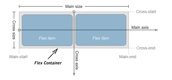
Flex items are positioned inside a flex container along a flex line, which is controlled by the flex-direction property. By default, there is only one flex line per flex container, aligned with the inline axis of the current writing mode or text direction. The following illustration clarifies the terminology of the flex layout.
Controlling Flow inside Flex Container
In the traditional CSS box model, elements are typically displayed in the order they appear in the HTML markup. However, flex layout allows you to control the flow direction inside a flex container, enabling elements to be laid out in any direction: leftwards, rightwards, downwards, or even upwards.
The flow of flex items within a flex container can be specified using the flex-direction property. Its default value is row, which
aligns with the document's current writing mode or text direction, such as left-to-right in English.
<style>
.flex-container {
    width: 80%;
    min-height: 300px;
    margin: 0 auto;
	font-size: 35px;
    /* Safari */
    display: -webkit-flex;
    -webkit-flex-direction: row-reverse;
    /* Standard syntax */
    display: flex;
    flex-direction: row-reverse;
    border: 5px solid purple;
}
</style>
Similarly, you can display flex items inside a flex container in columns instead of rows by setting the value of flex-direction to
column, like this:
<style>
.flex-container {
    width: 80%;
    min-height: 310px;
    margin: 0 auto;
	font-size: 35px;
    /* Safari */
    display: -webkit-flex;
    -webkit-flex-direction: column;
    /* Standard syntax */
    display: flex;
    flex-direction: column;
    border: 5px solid orange;
}
</style>
Controlling the Dimensions of Flex Items
The most significant aspect of the flex layout is the ability of flex items to adjust their width or height to fill the available space. This is achieved using the
flex property, which is a shorthand for flex-grow, flex-shrink,
and flex-basis properties.
A flex container distributes the free space among its items based on their flex grow factor or shrinks them proportionally to prevent overflow according to their flex shrink factor.
<style>
.flex-container {
    width: 80%;
    min-height: 300px;
    margin: 0 auto;
	font-size: 32px;
    display: -webkit-flex; /* Safari */
    display: flex; /* Standard syntax */
    border: 5px solid orange;
}
.flex-container div {
	padding: 10px;
}
.item1, .item3 {
	background: red;
	-webkit-flex: 1; /* Safari */
    flex: 1; /* Standard syntax */
}
.item2 {
	background: green;
	-webkit-flex: 2; /* Safari */
    flex: 2; /* Standard syntax */
}
</style>
In the above example, the first and third flex items will each occupy 1/4 of the free space (i.e., 1/(1+1+2)), while the second flex
item will occupy 1/2 of the free space (i.e., 2/(1+1+2)). This technique allows you to create various flexible layouts.
Note: Using the shorthand flex property is strongly recommended over using individual flex properties because it
correctly resets unspecified components.
Aligning Flex Items within Flex Container
There are four properties, justify-content, align-content,
align-items, and align-self designed to control the alignment of flex items within a flex container.
The first three apply to flex containers, while the last one applies to individual flex items.
Align Flex Items along Main Axis
Flex items can be aligned along the main axis (horizontal direction) of the flex container using the justify-content property. It is typically used when the flex items do not utilize all the available space along the main axis.
The justify-content property accepts the following values:
- flex-start — Default value. Flex items are placed at the start of the main axis.
- flex-end — Flex items are placed at the end of the main axis.
- center — Flex items are placed at the center of the main axis with equal amounts of free space on both ends. If there is negative leftover free space (i.e., item overflow), the flex items will overflow equally in both directions.
- space-between — Flex items are evenly distributed along the main axis, with the first item placed at the main-start edge and the last item placed at the
main-end. If there is item overflow or there's only one item, this value is equivalent to
flex-start. - space-around — Flex items are evenly distributed with half-sized spaces on either end. If there is item overflow or there's only one item, this value
is identical to
center.
The following example demonstrates the effect of different values for the justify-content property on a multiple-column flex container
with a fixed width.
<style>
.flex-container {
    width: 500px;
    min-height: 300px;
    margin: 0 auto;
	font-size: 32px;
    border: 5px solid purple;
    /* Safari */
    display: -webkit-flex;
    -webkit-justify-content: space-around;
    /* Standard syntax */
    display: flex;
    justify-content: space-around;
}
.flex-container div{
    padding: 10px;
}
.item1 {
    width: 75px;
    background: yellow;
}
.item2 {
    width: 125px;
    background: green;
}
.item3 {
    width: 175px;
    background: blue;
}
</style>
Align Flex Items along Cross Axis
Flex items can be aligned along the cross axis (perpendicular direction) of the flex container using the align-items or
align-self property. The align-items property is applied to the flex container, while
align-self is applied to individual flex items, overriding align-items when present. Both
properties accept the following values:
- flex-start — Flex items are placed at the start of the cross axis.
- flex-end — Flex items are placed at the end of the cross axis.
- center — Flex items are placed at the center of the cross axis with equal amounts of free space on both ends. If there is negative leftover free space (i.e., item overflow), the flex items will overflow equally in both directions.
- baseline — The text baseline (or inline axis) of each flex item is aligned with the baseline of the flex item with the largest
font-size. - stretch — The flex item stretches to fill the current row or column, unless restricted by minimum and maximum width or height. This is the default value for the
align-itemsproperty.
The following example demonstrates the effect of different values for the align-items property on a multiple-column flex container
with a fixed height.
<style>
.flex-container {
    width: 500px;
    min-height: 300px;
    margin: 0 auto;
	font-size: 32px;
    border: 5px solid orange;
    /* Safari */
    display: -webkit-flex;
    -webkit-align-items: center;
    /* Standard syntax */
    display: flex;
    align-items: center;
}
.flex-container div{
    padding: 10px;
}
.item1 {
    width: 80px;
    height: 100px;
    background: purple;
}
.item2 {
    width: 130px;
    height: 200px;
    background: yellow;
}
.item3 {
    width: 180px;
    height: 150px;
    background: lightgreen;
}
</style>
You can also distribute free space along the cross axis of a multiple-row or multiple-column flex container. The align-content property
is used to align the lines of the flex container (e.g., rows within a multiple-row flex container) when there is extra space in the cross axis, similar to how
justify-content aligns individual items along the main axis.
The align-content property accepts the same values as justify-content, but applies them to the
cross axis instead of the main axis. It also has one additional value:
- stretch The free space is equally distributed among all rows or columns, increasing their cross size. If the leftover free space is negative, this value is
equivalent to
flex-start.
The following example demonstrates the effect of different values for the align-content property on a multiple-row flex container
with a fixed height.
<style>
.flex-container {
    width: 500px;
    min-height: 300px;
    margin: 0 auto;
	font-size: 32px;
    border: 5px solid orange;
    /* Safari */
    display: -webkit-flex;
    -webkit-flex-flow: row wrap; /* wrap items to create multi-row flex container */
    -webkit-align-content: space-around;
    /* Standard syntax */
    display: flex;
    flex-flow: row wrap;
    align-content: space-around;
}
.flex-container div {
	width: 150px;
	height: 100px;
}
</style>
Reordering Individual Flex Items
In addition to modifying the flow within a flex container, you can change the order in which individual flex items are displayed using the
order property. This property accepts positive or negative integers as values. By default, all flex items are displayed and laid out
in the same order as they appear in the HTML markup, with a default order value of 0.
The following example demonstrates how to control the order of an individual flex item.
<style>
.flex-container {
    width: 80%;
    min-height: 310px;
    margin: 0 auto;
	font-size: 32px;
    border: 5px solid orange;
    display: -webkit-flex; /* Safari 6.1+ */
    display: flex;
}
.flex-container div {
	padding: 15px;
	-webkit-flex: 1; /* Safari 6.1+ */
	-ms-flex: 1; /* IE 10 */
	flex: 1; /* Standard syntax */
}
.item1 {
	background: pink;
    -webkit-order: 2; /* Safari 6.1+ */
	order: 2;
}
.item2 {
	background: skyblue;
    -webkit-order: 1; /* Safari 6.1+ */
    order: 1;
}
.item3 {
	background: lightyellow;
    -webkit-order: -1; /* Safari 6.1+ */
    order: -1;
}
</style>
Note: Items with lower order values are displayed first, while those with higher order values are displayed at the end. Items with the same order value are displayed in the order they appear in the source document.
Horizontal and Vertical Center Alignment with Flexbox
Flexbox allows for easy horizontal and vertical center alignment of content blocks, eliminating the need for JavaScript or complex CSS tricks.
The following example demonstrates how to vertically and horizontally align a content block in the middle using the CSS3 flexible box feature.
<style>
.flex-container {
    width: 500px;
    min-height: 300px;
    margin: 0 auto;
	font-size: 22px;
    border: 5px solid purple;
    display: -webkit-flex; /* Safari 6.1+ */
    display: flex;  /* Standard syntax */
}
.item {
    width: 300px;
    padding: 30px;
    margin: auto;
    text-align: center;
    background: orange;
}
</style>
Enable Wrapping of Flex Items
By default, flex containers display a single row or column of flex items. However, you can utilize the flex-wrap property on the flex
container to control whether its flex items wrap into multiple lines or remain on a single line when there is insufficient space.
- nowrap — Default value. Flex items are placed in a single line. This may cause overflow if there is insufficient space on the flex line.
- wrap — The flex container breaks its flex items across multiple lines, similar to how text is wrapped onto a new line when it exceeds the current line's width.
- wrap-reverse — The flex items wrap if necessary, but in reverse order, meaning the cross-start and cross-end directions are swapped.
Note: The following example demonstrates how to display flex items in a single line or multiple lines within a flex container using the
flex-wrap property.
<style>
.flex-container {
    width: 500px;
    min-height: 320px;
    margin: 0 auto;
    font-size: 32px;
    border: 5px solid black;
    /* Safari */
    display: -webkit-flex;
    -webkit-flex-wrap: wrap;
    /* Standard syntax */
    display: flex;
    flex-wrap: wrap;
}
.flex-container div{
    padding: 10px;
    width: 130px;
}
</style>
Note: Alternatively, you can use the shorthand flex-flow property to set both flex-direction
and flex-wrap in a single declaration. The values can be provided in any order, and it accepts the same values as the individual properties.
FAQ
What is Flexbox, and why was it introduced in CSS3?
Flexbox, short for Flexible Box Layout, is a layout model introduced in CSS3 to provide a more efficient way to design complex layouts when compared to traditional CSS box model. It was introduced to address the limitations of the float and inline-block methods, making it easier to create responsive and flexible web layouts.
How do you enable Flexbox on an element?
To enable Flexbox on an element, you need to set its display property to flex or inline-flex. For example:
.container {
  display: flex;
}
This turns the container into a flex container, and its direct child elements become flex items.
What are the main components of a Flexbox layout?
A Flexbox layout consists of the following main components:
- Flex Container: The parent element with
display: flexordisplay: inline-flex. - Flex Items: The child elements inside the flex container.
- Main Axis: The primary axis along which flex items are laid out.
- Cross Axis: The perpendicular axis to the main axis.
What is the purpose of the flex-direction property?
The flex-direction property determines the main axis along which flex items are arranged within the flex container. It can have values like row, row-reverse, column, or column-reverse, which control the direction of layout.
How does the justify-content property work in Flexbox?
The justify-content property controls the alignment of flex items along the main axis. It has various values, such as flex-start, flex-end, center, space-between, and space-around, which determine how space is distributed among the items.
What is the purpose of the align-items property in Flexbox?
The align-items property controls the alignment of flex items along the cross axis. It can take values like flex-start, flex-end, center, baseline, or stretch, influencing how items are positioned relative to each other within the container.
How does the flex-grow property affect flex items?
The flex-grow property specifies how much a flex item should grow relative to other flex items when there is extra space in the flex container. It is a unitless value, and items with higher flex-grow values will grow more than those with lower values.
What is the purpose of the flex-shrink property in Flexbox?
The flex-shrink property defines how much a flex item should shrink when there is not enough space in the flex container. It is also a unitless value and determines the item's ability to shrink relative to other items.
How can you reorder flex items using Flexbox?
You can reorder flex items using the order property. By default, all items have an order of 0. You can assign positive or negative values to change their order, with items having lower values appearing first and items with higher values appearing later.
How does the align-self property work in Flexbox?
The align-self property allows you to override the align-items property for individual flex items within a container. It accepts values like flex-start, flex-end, center, baseline, or stretch, letting you control the alignment of a specific item along the cross axis.
Explain the concept of a "flexbox nowrap container"?
By default, a flex container is set to "nowrap" for its flex-wrap property, meaning that flex items are arranged in a single line, and they do not wrap onto multiple lines when the container's width is insufficient. This behavior can be changed by setting flex-wrap to wrap if you want items to wrap onto a new line as needed.
What are the differences between Flexbox and CSS Grid layout?
Flexbox and CSS Grid layout are both layout models in CSS, but they have different use cases and behaviors. Flexbox is primarily designed for one-dimensional layouts (either rows or columns) and is ideal for aligning items along a single axis, whereas CSS Grid layout is designed for two-dimensional layouts with rows and columns, making it suitable for more complex grid-based designs.
What is the flex shorthand property, and how does it work?
The flex shorthand property combines flex-grow, flex-shrink, and flex-basis properties into a single declaration. For example, flex: 1 0 auto sets flex-grow to 1, flex-shrink to 0, and flex-basis to auto, which is a common configuration for flex items that should grow but not shrink.
How do you create a centered, responsive navigation bar using Flexbox?
To create a centered, responsive navigation bar using Flexbox, you can:
- Make the container a flex container with
display: flex. - Use
justify-content: centerto horizontally center the items. - Optionally, use
align-items: centerto vertically center the items. - Set
flex-wrap: wrapto allow items to wrap to the next line on smaller screens.
These properties will ensure that the navigation bar remains centered and adjusts its layout as the screen size changes.
What is the purpose of the flex-flow property in Flexbox?
The flex-flow property is a shorthand for setting both flex-direction and flex-wrap properties in one declaration. It allows you to define the main axis direction and whether flex items should wrap or not in a single line of code. For example:
.container {
  flex-flow: row wrap;
}
How do you create a responsive, centered, and vertically aligned button using Flexbox?
To create a responsive, centered, and vertically aligned button using Flexbox, you can do the following:
.button-container {
  display: flex;
  justify-content: center;
  align-items: center;
  height: 100vh; /* Optionally, make it full-height */
}

.button {
  /* Styles for the button */
}
This code centers the button both horizontally and vertically within its container, making it responsive and easy to style.
Conclusion
Flexbox in CSS stands as a powerful and versatile tool, revolutionizing the way we approach layout design with its innovative
display: flex property. This flexible layout model, encompassed by the Flex Layout Model, introduces an intuitive approach
to controlling the flow and dimensions of elements within a container. By mastering techniques such as controlling flow, dimensions, and
alignment along both the main and cross axes, designers can create layouts that seamlessly adapt to diverse screen sizes and orientations.
Techniques like reordering individual items and facilitating horizontal and vertical center alignment provide additional flexibility, enabling designers to craft visually appealing and responsive designs. For designers seeking expertise, resources like CSS tricks Flexbox and Flexbox cheat sheets serve as invaluable guides. These tools provide additional insights and tricks, ensuring a smooth and efficient journey into the world of flexible and adaptive web layouts.